In this entry I will show you how to create a Gantt chart in R using the ggplot2 package. Gantt charts are a great way to visualise project schedules. Although there are several packages that advocate building Gantt charts in R, I have decided that the easiest and most flexible way is to build them using the ggplot2 package. So, here is a step-by-step guide.
Install and load the required packages
First, make sure you have the ggplot2, dplyr, tidyr, lubridate, and forcats packages installed. A shortcut for using these packages is to directly install and load the tidyverse bunch of packages.
# Load the libraries---------------------------------------------------------# install the package (uncomment if the package is not installed)# install.packages("tidyverse")# load the ggplot2 packagelibrary(tidyverse)
── Attaching core tidyverse packages ──────────────────────── tidyverse 2.0.0 ──
✔ dplyr     1.1.4     ✔ readr     2.1.5
✔ forcats   1.0.0     ✔ stringr   1.5.1
✔ ggplot2   3.5.1     ✔ tibble    3.2.1
✔ lubridate 1.9.3     ✔ tidyr     1.3.1
✔ purrr     1.0.2
── Conflicts ────────────────────────────────────────── tidyverse_conflicts() ──
✖ dplyr::filter() masks stats::filter()
✖ dplyr::lag()    masks stats::lag()
ℹ Use the conflicted package (<http://conflicted.r-lib.org/>) to force all conflicts to become errors
Prepare your data
Prepare your data in a tibble. Your data should include columns for the task name, start date and end date. To define dates we use the ymd() function from the lubridate package, which allows you to define Dates easily as strings.
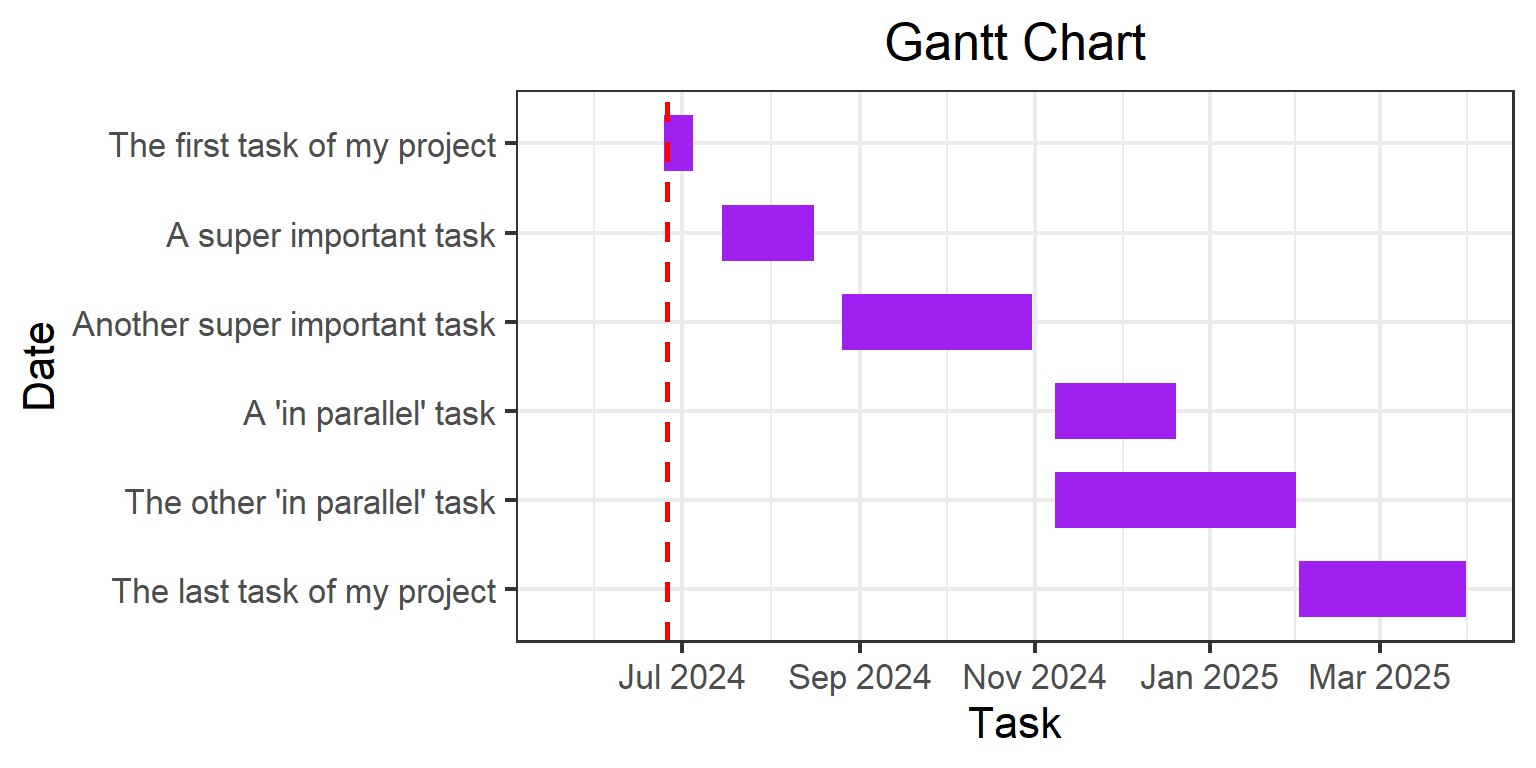
# Create the tasks-----------------------------------------------------------tasks <-tibble(task =c(# task 1 "The first task of my project", # task 2"A super important task", # task 3"Another super important task",# task 4"A 'in parallel' task",# task 5"The other 'in parallel' task", # task 6"The last task of my project"),start =c(# task 1 ymd("2024-06-25"),# task 2ymd("2024-07-15"),# task 3 ymd("2024-08-26"),# task 4 ymd("2024-11-08"),# task 5ymd("2024-11-08"),# task 6ymd("2025-02-01") ),end =c(# task 1ymd("2024-07-05"),# task 2ymd("2024-08-16"),# task 3ymd("2024-10-31"),# task 4ymd("2024-12-20"),# task 5ymd("2025-01-31"),# task 6ymd("2025-03-31") ))tasks
# A tibble: 6 × 3
  task                         start      end
  <chr>                        <date>     <date>
1 The first task of my project 2024-06-25 2024-07-05
2 A super important task       2024-07-15 2024-08-16
3 Another super important task 2024-08-26 2024-10-31
4 A 'in parallel' task         2024-11-08 2024-12-20
5 The other 'in parallel' task 2024-11-08 2025-01-31
6 The last task of my project  2025-02-01 2025-03-31
Once the tasks are created, we pivot the data longer to feed the ggplot() function in a convenient way. pivot_longer() is a function from the tidyr package which allow to convert a tibble from wide to long format.
# A tibble: 12 × 3
   task                         type  date
   <chr>                        <chr> <date>
 1 The first task of my project start 2024-06-25
 2 The first task of my project end   2024-07-05
 3 A super important task       start 2024-07-15
 4 A super important task       end   2024-08-16
 5 Another super important task start 2024-08-26
 6 Another super important task end   2024-10-31
 7 A 'in parallel' task         start 2024-11-08
 8 A 'in parallel' task         end   2024-12-20
 9 The other 'in parallel' task start 2024-11-08
10 The other 'in parallel' task end   2025-01-31
11 The last task of my project  start 2025-02-01
12 The last task of my project  end   2025-03-31
Plot the diagram
Once we have the tasks in a convenient format we can create the chart First, we define the language of the dates that will be appear in the month names of the chart
# Create the Gantt chart-----------------------------------------------------# set the language of the months# in englishSys.setlocale("LC_TIME", "en_EN")
[1] "en_EN"
# in spanish# Sys.setlocale("LC_TIME", "es_ES")
Now we go for the ggplot(). With ggplot2, you start a plot with the ggplot() function. It creates a coordinate system to which you can add layers to. The first argument of ggplot() is the dataset to use in the graph. So tasks_long |> ggplot() creates an empty graph. To complete the graph by adding one or more layers to ggplot(). The geom_line() function adds a layer of lines to the plot. Every geom function in ggplot2 takes a mapping argument. This defines how variables in your dataset are mapped to visual properties. The mapping argument is always paired with aes(), and the ‘x’ and ‘y’ arguments of aes() specify which variables to map to the x and y axes.
To build our Gantt chart, we use geom_line() to define the tasks. We have each task twice in the tasks_long tibble, with two different dates. So we define the argument ‘y’ with the task variable and the argument ‘x’ with the date variable.
Note
Note that the ‘size’ and ‘color’ arguments are outside of the aes() function, so these arguments don’t depend on the data and are fixed.
We use the fct_inorder() and fct_rev() functions from the forcats package to set the order of the factors. Specifically, with fct_inorder we define the order of the tasks in the same order as they appear in the tasks_long tibble. Then with the fct_rev() we start from top to bottom to display the tasks.
Then, we use geom_vline()to definethe current date with a vertical line.
Next, we define the axis of the dates. We use the scale_x_date() function to define the x axis. Setting the limits allows us to centre the breaks in the graph. With the ‘date_breaks’ argument we can adjust the frequency of the breaks according to our time frame (n weeks, n months, n years, etc.) and with the ‘date_labels’ argument we can specify how the date appears in the plot.
Finally, we make the last adjustments of the plot. We use the labs() function to set the title and the names of the x and y axes. The theme_bw() function sets a minimalist theme, with the ‘base_size’ argument we set the size of all the texts in the plot, and with theme(plot.title = element_text(hjust = 0.5)) we centre the title of the plot.